Ubicomp 2012 Conference Website
2012
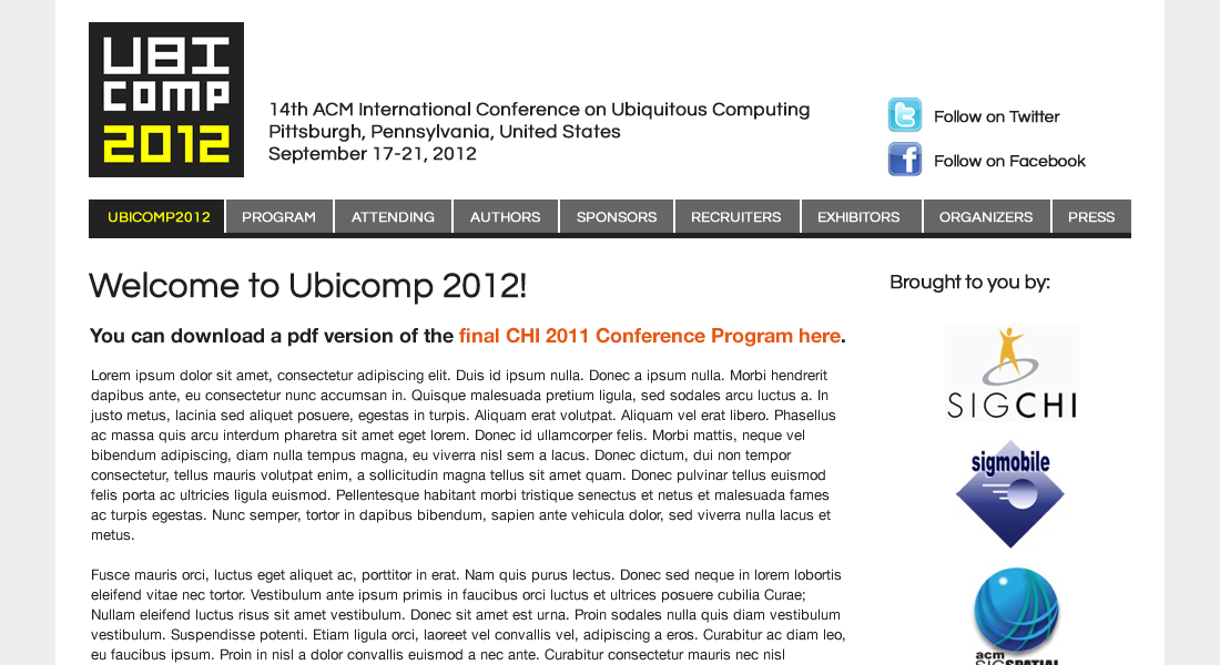
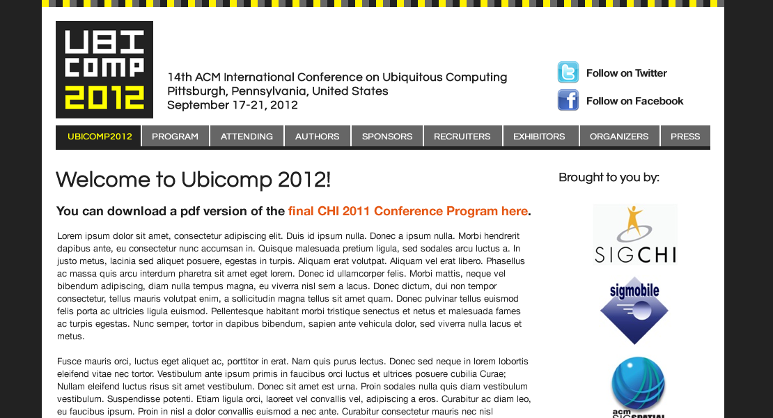
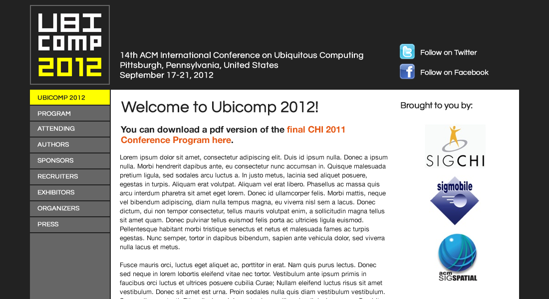
In 2012, the Ubicomp conference was in Pittsburgh. My advisor Anind Dey was the General Chair and he asked me to design the conference web site. My design incorporated elements that represent Pittsburgh and the technological focus of the conference.
Logo
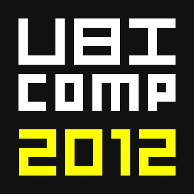
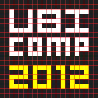
I constructed the logo using a 21 × 21 grid of squares, where the letters are made of square "pixels" in the grid. The pixelated letters suggest the technical focus of the conference.
The colors black and yellow/gold to represent Pittsburgh. If you're familiar with Pittsburgh teams, you'd know that major sports teams in Pittsburgh use black and gold.
Layout
I matched the design of the layout to the logo design. The layout has blocky elements and uses colors similar to the logo.
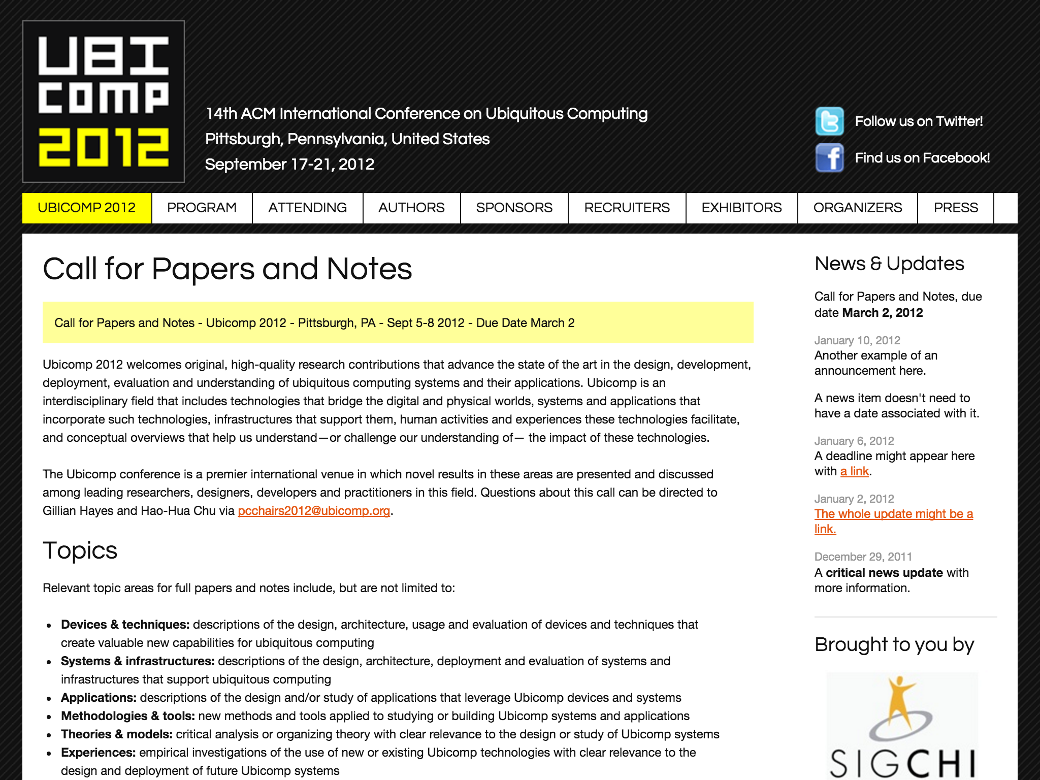
Some layouts exploring different elements.
